ShopDreamUp AI ArtDreamUp
Deviation Actions


Suggested Deviants


Suggested Collections


You Might Like…


Featured in Groups


Description


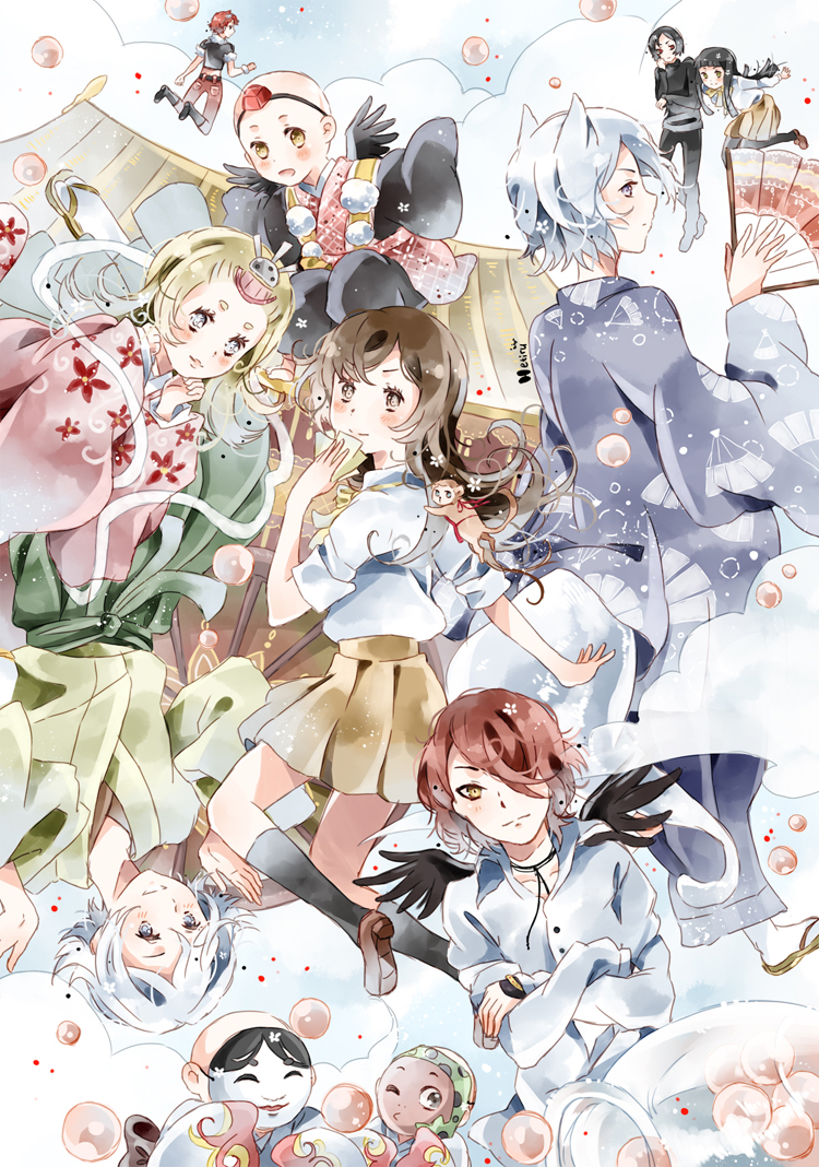
Finally I finished it/////// One week at allO__o
AWW I started to draw this big picture August 14 and only now I completed to colour it/// For me it's a little difficult to draw pictures with many characters, but Kamisama really worths it//
I read this manga for a long time - maybe 3 years, and waiting each chapter with impatience, So then this winter I found out THERE WILL BE AN ANIME, I felt something like from happiness==>


When I saw the list of seiyuu, my happiness was much bigger, beause.. AWWWWWWWWWWDFSDGDFHDTHDFf Tachibana Shinnoskeeeeeeeee I LOVE HIM SO BAD GUYSSSSSSSSSS
 And Daisuke Kishio tooooooooooooo/
And this day became!! Today is October 1, the day when the first episode of this anime will appear on all TV of Japan!! I'm waiting it!!// And will be waiting always~~~///
Hope you like it))
--------------------------------------------------------
Anime/manga: Kamisama Hajimemashita
Programe: SAI, Photoshop
Time: 1 week
Date: August 14 ~ October 1
-------------------------------------------------------
Kamisama Hajimemashita (c) Suzuki Julietta
Image size
750x1068px 825.95 KB
© 2012 - 2024 Hetiru
Comments118
Join the community to add your comment. Already a deviant? Log In
Overall, I love your sense of composition. It's not cluttered, and each character brings something to the picture! Your technique is fantastic too! I think even if the anatomy isn't perfect, nothing detracts from the main idea of the picture, and it fits very well in your style.
What I think could be improved might be some contrast in the colors. Like maybe the characters in the foreground could have more saturated colors while the characters in the background could have more muted colors. This would bring a bigger sense of depth into the picture. I think it would also help set apart the characters on the left side of the picture (since there are so many, and at first glance, I thought the white hair boy (?) and the blond girl were attached to the same body XD (think a face playing card, King Queen, Jack) I think a bigger contrast in colors would do the trick.
I also want to suggest varying your lineart a bit more, like adding thickness to bring out certain characters or emphasis to the objects/ characters in the front, but I also think that the thin lineart suits your coloring and your coloring style so well, so I'm not sure what to say about that. Well, either way, maybe you can experiment and see if it will work for you or just ignore this advice if it doesn't.
Anyway, I love your artwork!! I can't wait to see what you come up with next ^^